

Online Account Cleanup
Online Account Cleanup
Enhance user engagement and value perception by improving the feature introductory page of Online Account Cleanup, achieving higher enrollment rates.
Enhance user engagement and value perception by improving the feature introductory page of Online Account Cleanup, achieving higher enrollment rates.



Role
Lead UX designer working collaboratively with UX researcher, content writer, illustrator and product managers.
What is Online account cleanup?
It's said that people have an average of over 300 online accounts, with most of them being accounts that are no longer needed. Online Account Cleanup assists in finding and deleting these unnecessary online accounts.
This project involves transforming the Online Account Cleanup feature, originally developed as a web app, into a mobile version. In this portfolio, I aimed to show how I improved the user experience issues that were present in the web app and applied those improvements to the mobile version.
what was the problem?
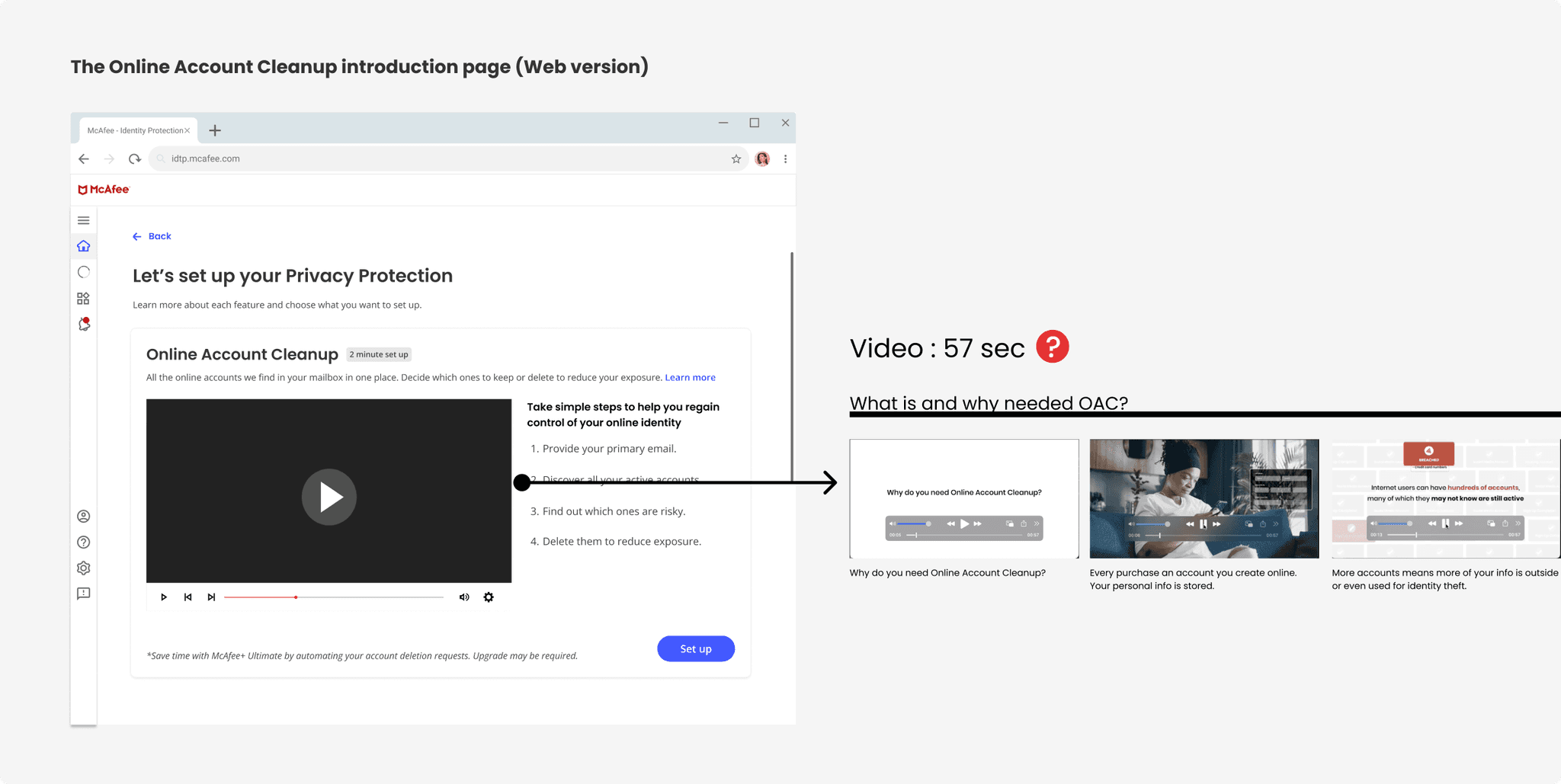
Below is the feature introduction page for the already released web version of Online Account Cleanup. Through this screen, users come to understand and appreciate the value of this feature, leading them to enroll.
To introduce Online Account Cleanup to users, there is a detailed video on the screen. The idea of using a video to introduce the feature was discovered through user research. We confirmed through this research that a video is the best way for participants to understand the feature.
However, after the feature was released, the reality was that users rarely clicked on the video. Since the only way to learn about the feature was through the video, and they weren’t watching it, naturally the enrollment numbers for this feature were extremely low.
Therefore, while recreating this feature for the mobile version, I tried to improve this page to increase user engagement
Online Account Cleanup
Enhance user engagement and value perception by improving the feature introductory page of Online Account Cleanup, achieving higher enrollment rates.
Role
Lead UX designer working collaboratively with UX researcher, content writer, illustrator and product managers.
What is Online account cleanup?
It's said that people have an average of over 300 online accounts, with most of them being accounts that are no longer needed. Online Account Cleanup assists in finding and deleting these unnecessary online accounts.
This project involves transforming the Online Account Cleanup feature, originally developed as a web app, into a mobile version. In this portfolio, I aimed to show how I improved the user experience issues that were present in the web app and applied those improvements to the mobile version.
what was the problem?
Below is the feature introduction page for the already released web version of Online Account Cleanup. Through this screen, users come to understand and appreciate the value of this feature, leading them to enroll.
To introduce Online Account Cleanup to users, there is a detailed video on the screen. The idea of using a video to introduce the feature was discovered through user research. We confirmed through this research that a video is the best way for participants to understand the feature.
However, after the feature was released, the reality was that users rarely clicked on the video. Since the only way to learn about the feature was through the video, and they weren’t watching it, naturally the enrollment numbers for this feature were extremely low.
Therefore, while recreating this feature for the mobile version, I tried to improve this page to increase user engagement

Online Account Cleanup
Enhance user engagement and value perception by improving the feature introductory page of Online Account Cleanup, achieving higher enrollment rates.
Role
Lead UX designer working collaboratively with UX researcher, content writer, illustrator and product managers.
What is Online account cleanup?
It's said that people have an average of over 300 online accounts, with most of them being accounts that are no longer needed. Online Account Cleanup assists in finding and deleting these unnecessary online accounts.
This project involves transforming the Online Account Cleanup feature, originally developed as a web app, into a mobile version. In this portfolio, I aimed to show how I improved the user experience issues that were present in the web app and applied those improvements to the mobile version.
what was the problem?
Below is the feature introduction page for the already released web version of Online Account Cleanup. Through this screen, users come to understand and appreciate the value of this feature, leading them to enroll.
To introduce Online Account Cleanup to users, there is a detailed video on the screen. The idea of using a video to introduce the feature was discovered through user research. We confirmed through this research that a video is the best way for participants to understand the feature.
However, after the feature was released, the reality was that users rarely clicked on the video. Since the only way to learn about the feature was through the video, and they weren’t watching it, naturally the enrollment numbers for this feature were extremely low.
Therefore, while recreating this feature for the mobile version, I tried to improve this page to increase user engagement

Online Account Cleanup
Enhance user engagement and value perception by improving the feature introductory page of Online Account Cleanup, achieving higher enrollment rates.
Role
Lead UX designer working collaboratively with UX researcher, content writer, illustrator and product managers.
What is Online account cleanup?
It's said that people have an average of over 300 online accounts, with most of them being accounts that are no longer needed. Online Account Cleanup assists in finding and deleting these unnecessary online accounts.
This project involves transforming the Online Account Cleanup feature, originally developed as a web app, into a mobile version. In this portfolio, I aimed to show how I improved the user experience issues that were present in the web app and applied those improvements to the mobile version.
what was the problem?
Below is the feature introduction page for the already released web version of Online Account Cleanup. Through this screen, users come to understand and appreciate the value of this feature, leading them to enroll.
To introduce Online Account Cleanup to users, there is a detailed video on the screen. The idea of using a video to introduce the feature was discovered through user research. We confirmed through this research that a video is the best way for participants to understand the feature.
However, after the feature was released, the reality was that users rarely clicked on the video. Since the only way to learn about the feature was through the video, and they weren’t watching it, naturally the enrollment numbers for this feature were extremely low.
Therefore, while recreating this feature for the mobile version, I tried to improve this page to increase user engagement

Online Account Cleanup
Enhance user engagement and value perception by improving the feature introductory page of Online Account Cleanup, achieving higher enrollment rates.
Diverse Approaches to Showcasing Features
Diverse Approaches to Showcasing Features
Diverse Approaches to Showcasing Features
Products in categories that are challenging for users to understand easily and require effort to grasp, were investigated to see what methods they use to introduce their features and attract user’s interest.
Products in categories that are challenging for users to understand easily and require effort to grasp, were investigated to see what methods they use to introduce their features and attract user’s interest.
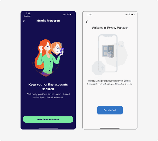


Simple copy with an illustration
Simple copy with an illustration
Users would be familiar with this format since it's a common way to convey information.
Users would be familiar with this format since it's a common way to convey information.
Since an excess of textual information can overwhelm users, the challenge lies in effectively conveying a large amount of information on a small mobile screen without causing a burden.
Since an excess of textual information can overwhelm users, the challenge lies in effectively conveying a large amount of information on a small mobile screen without causing a burden.
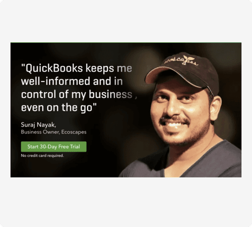


Testimonials
Testimonials
Genuine reviews and pictures from users can help build trust in the product.
Genuine reviews and pictures from users can help build trust in the product.
Using testimonials alone without any explanation of the feature might make it difficult for users to understand the feature.
Using testimonials alone without any explanation of the feature might make it difficult for users to understand the feature.
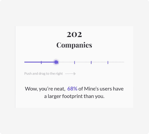


User-Driven Learning
User-Driven Learning
Users who actively participate in interactions can learn a lot.
Users who actively participate in interactions can learn a lot.
Just like testimonials, using this on its own without explaining the feature might be difficult to understand.
Just like testimonials, using this on its own without explaining the feature might be difficult to understand.
Quick Test the concept solutions
Quick Test the concept solutions
Quick Test the concept solutions
Created several solution concept prototypes quickly and conducted user testing on these prototypes to gather user feedback
Created several solution concept prototypes quickly and conducted user testing on these prototypes to gather user feedback
Concepts to test
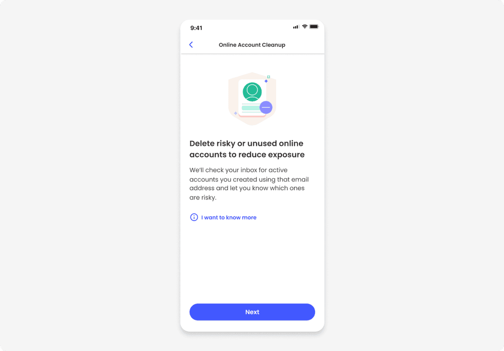


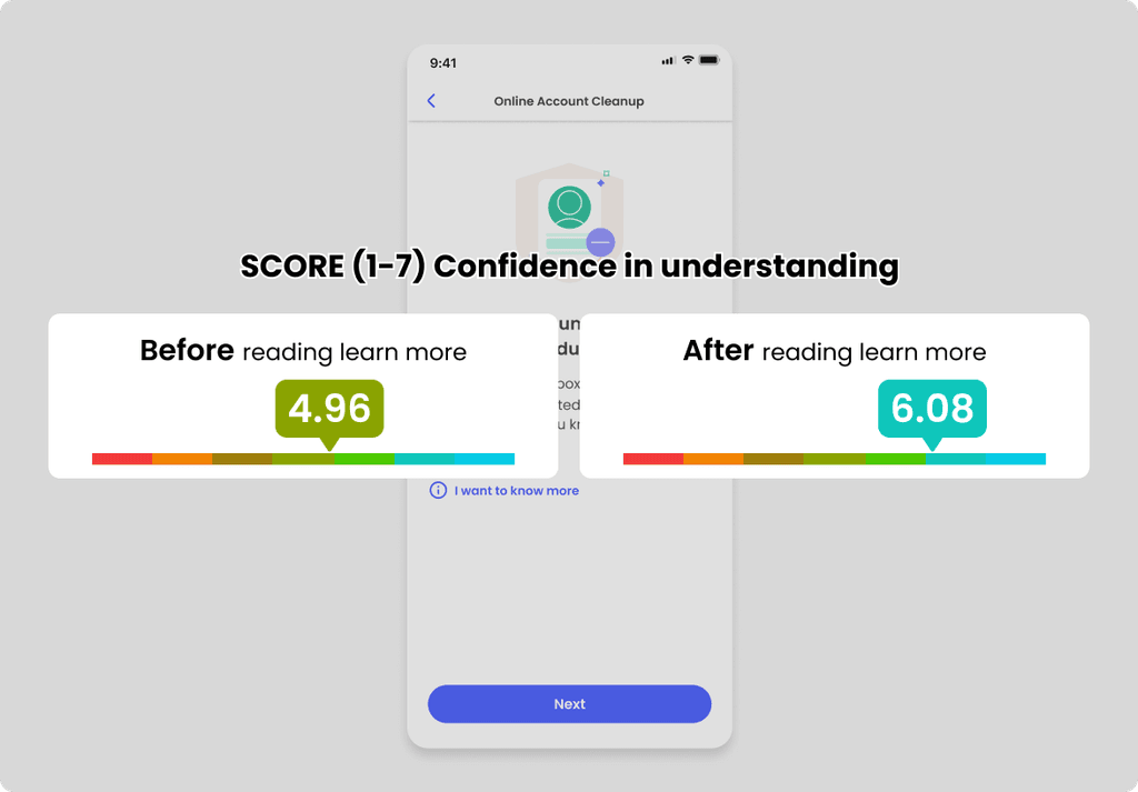
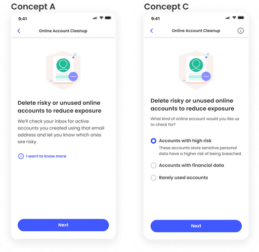
Concept A (Illustration + Simple content)
Concept A (Illustration + Simple content)
A common way of introducing features with illustrations and text. When users tap on "I want to know more," they can see more detailed information.
A common way of introducing features with illustrations and text. When users tap on "I want to know more," they can see more detailed information.
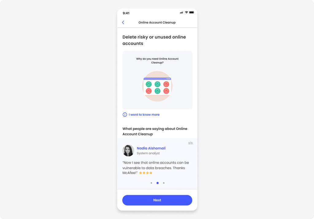


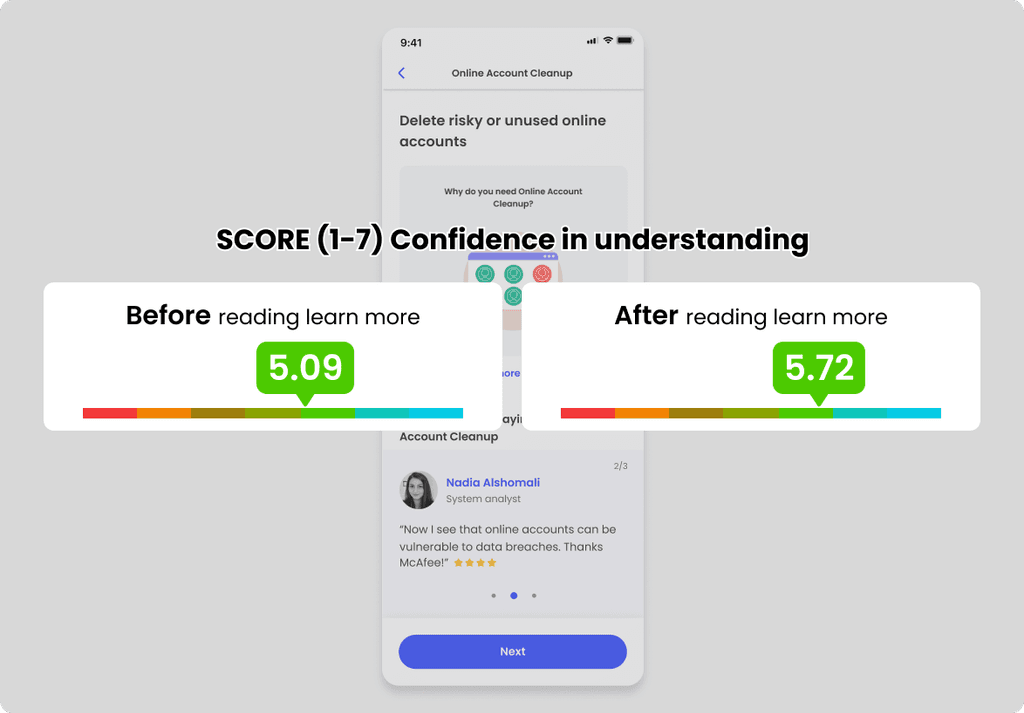
Concept B (Animation + Testimonials)
Concept B (Animation + Testimonials)
In the original web version, instead of having a Play button on a Black screen, which gives a feeling of being masked, a Json Lottie animation is designed to play automatically as soon as the page opens, allowing users to immediately see the feature's explanation. Below that, a testimonial is added to foster more trust in the feature.
In the original web version, instead of having a Play button on a Black screen, which gives a feeling of being masked, a Json Lottie animation is designed to play automatically as soon as the page opens, allowing users to immediately see the feature's explanation. Below that, a testimonial is added to foster more trust in the feature.
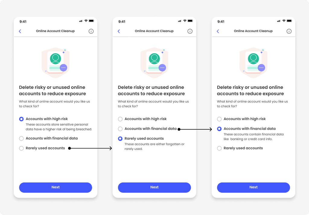


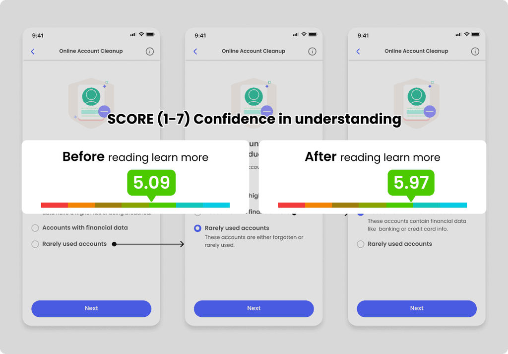
Concept C (User-driven learning)
Concept C (User-driven learning)
Users can naturally learn about the features by selecting the type of online accounts they wish to delete using radio buttons.
Users can naturally learn about the features by selecting the type of online accounts they wish to delete using radio buttons.
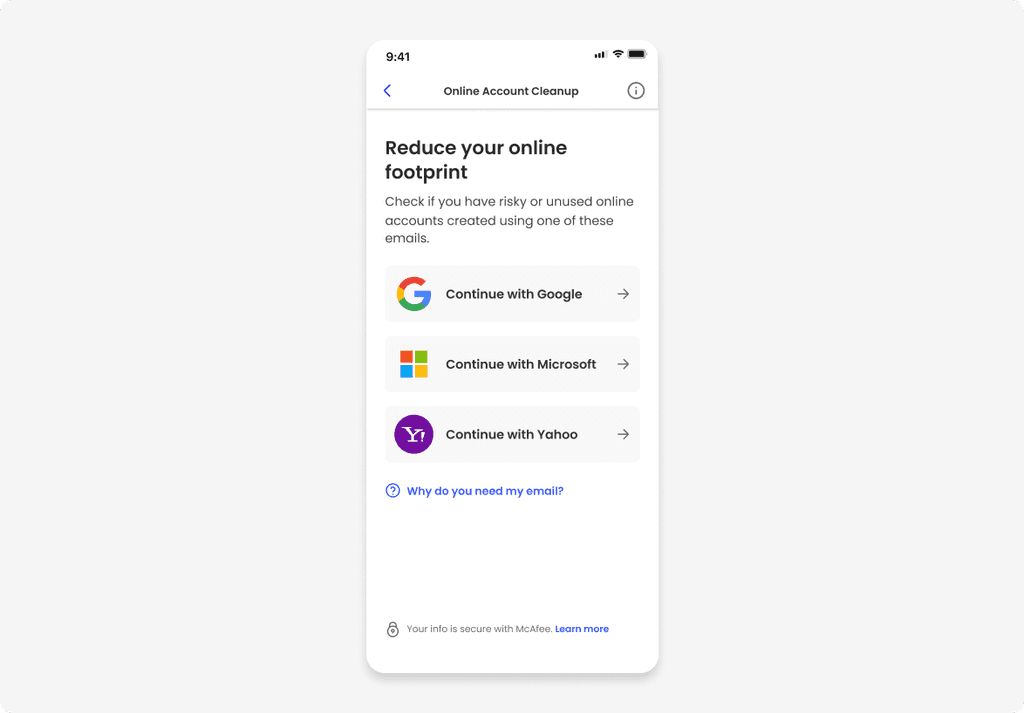


Concept D (Without any introduction)
Concept D (Without any introduction)
This idea came from our PM, starting with the question : Do we really need a feature introductory page? It's about letting users jump right in, choose an email account to check, and start the process without any introductory page, so they get to learn about the feature by actually using it.
This idea came from our PM, starting with the question : Do we really need a feature introductory page? It's about letting users jump right in, choose an email account to check, and start the process without any introductory page, so they get to learn about the feature by actually using it.
User testing
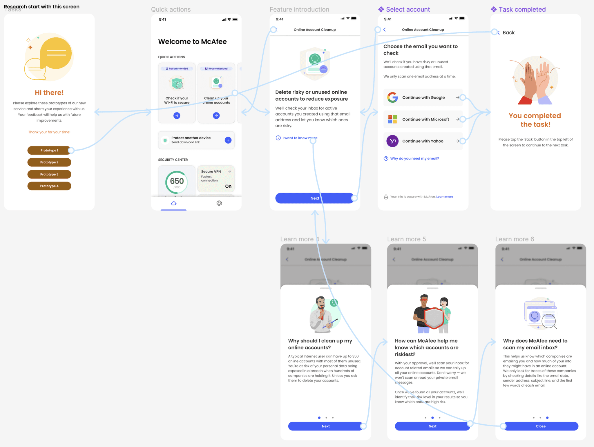
Participants were given a prototype link and tested the four concepts shown above. After testing all the prototypes, they were asked to rate their confidence in understanding on a scale of 1 to 7. They rated each concept they tested and provided detailed reasons for their scores.
50 USA participants recruited by UsabilityHub / Age range : 22 ~55


Result


Concept A - Quotes from users
Concept A - Quotes from users
Score 1-3
“I feel like I need more info about what permissions it has to my inboxes to feel confident and secure”
Score 1-3
“I feel like I need more info about what permissions it has to my inboxes to feel confident and secure”
Score 4-5
“I feel confident that it checks email address for any risky accounts interacting with that email address.”
Score 4-5
“I feel confident that it checks email address for any risky accounts interacting with that email address.”
Score 6-7
“It seems pretty self explanatory. I’m confident in my understanding of what it’s supposed to do. ”
Score 6-7
“It seems pretty self explanatory. I’m confident in my understanding of what it’s supposed to do. ”


Concept B - Quotes from users
Concept B - Quotes from users
Score 1-3
“The site doesn’t tell me enough, and I find the animations confusing and distracting.”
Score 1-3
“The site doesn’t tell me enough, and I find the animations confusing and distracting.”
Score 4-5
“I want more knowledge on this thru a simple tutorial”
“I think it seems easy but it also is a bit confusing.”
Score 4-5
“I want more knowledge on this thru a simple tutorial”
“I think it seems easy but it also is a bit confusing.”
Score 6-7
“It clearly shows what the benefits are and what will be protected”
Score 6-7
“It clearly shows what the benefits are and what will be protected”


Concept C - Quotes from users
Concept C - Quotes from users
Score 1-3
“I don't think any cleaner can help with data breaches online when it's stored with big companies”
Score 1-3
“I don't think any cleaner can help with data breaches online when it's stored with big companies”
Score 4-5
“I feel that I have a general idea because it was explained what they do”
Score 4-5
“I feel that I have a general idea because it was explained what they do”
Score 6-7
“The language is SUPER plain. Nothing is hiding in a flourish of language which makes it seem honest on top of super clear.”
Score 6-7
“The language is SUPER plain. Nothing is hiding in a flourish of language which makes it seem honest on top of super clear.”
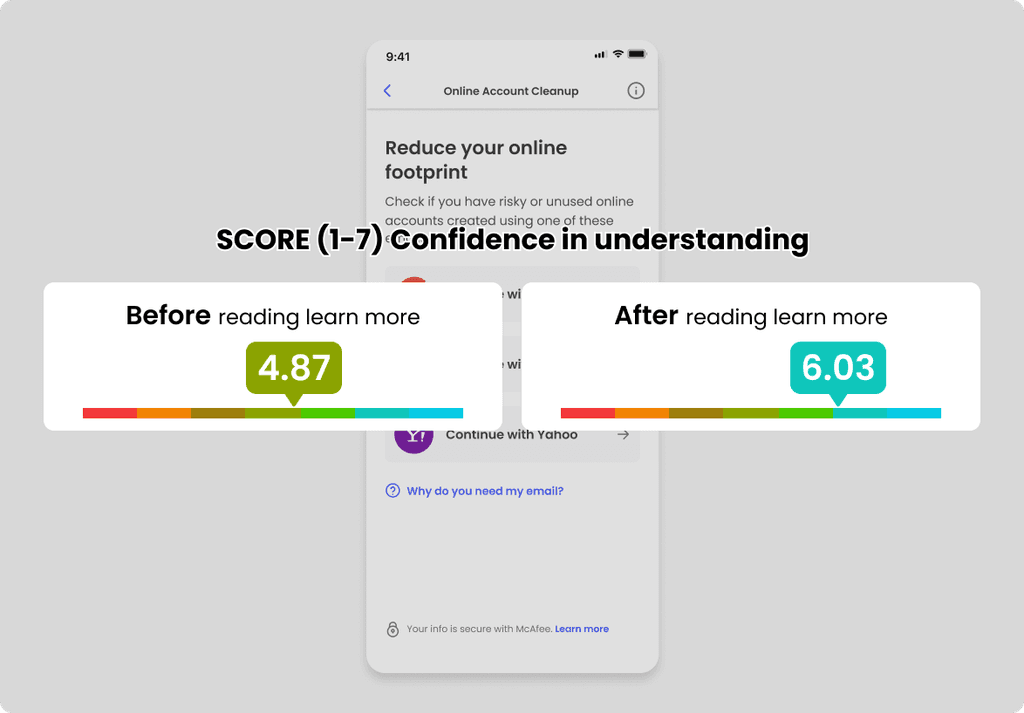


Concept D - Quotes from users
Concept D - Quotes from users
Score 1-3
“Because, I don't know what online account cleanup really means. What will you do? It's asking to give access to my Gmail. Why should I give access.”
Score 1-3
“Because, I don't know what online account cleanup really means. What will you do? It's asking to give access to my Gmail. Why should I give access.”
Score 4-5
“Seems pretty basic, but would read more into it before actually using”
Score 4-5
“Seems pretty basic, but would read more into it before actually using”
Score 6-7
“It seems professional but maybe explain how it works will make me more confident”
Score 6-7
“It seems professional but maybe explain how it works will make me more confident”
Discussion with stakeholders about the result
Research team recommended:
Combine Concept A and Concept C by letting users know how Online Account Cleanup(OAC) works, while also educating them on the types of accounts they may want to delete. This will help increase their confidence and understanding of OAC.
Avoid forcing users to make a decision between accounts that are high risk, have financial data, or are rarely used before proceeding with help. (They may not feel confident enough to make a decision, or may find all of the options important and not know which to choose, which may contribute to drop-off


Other recommendation :
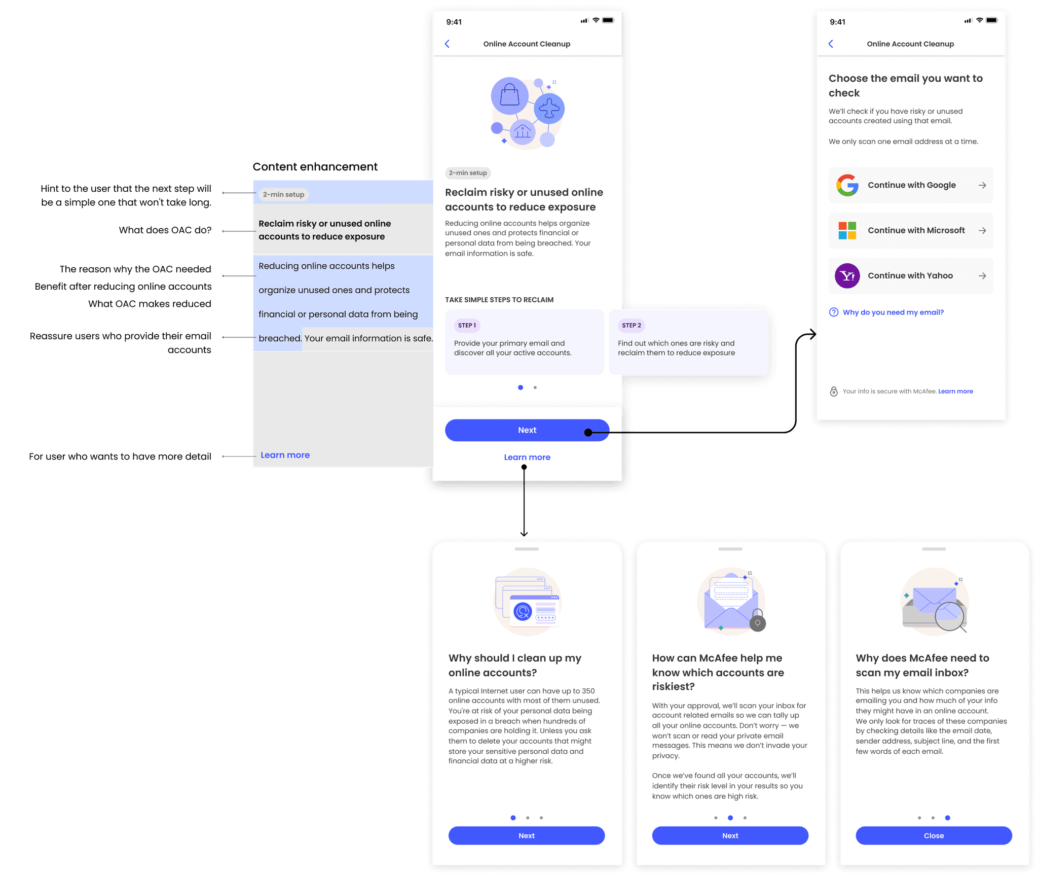
Enhance content by adding benefits if user reduce exposure, adding a hint that next step would be simple and reassuring users who provide their email accounts.
Other recommendation :
Enhance content by adding benefits if user reduce exposure, adding a hint that next step would be simple and reassuring users who provide their email accounts.
FinaL design for feature introduction PAge
FinaL design for feature introduction PAge
FinaL design for feature introduction PAge
After several design iterations, the final design reflecting feedback was created and delivered.
After several design iterations, the final design reflecting feedback was created and delivered.


Results and Lessons Learned
Results and Lessons Learned
Results and Lessons Learned
“It has recorded an average of 16K enrollments per week as of November 2023.”
“It has recorded an average of 16K enrollments per week as of November 2023.”
This result marked a huge jump in enrollments, adding 300% more than Web OAC and even surpassing other security features in the app, showing us that sometimes the simplest things work the best.
Even though we're always on the lookout for new and better ways to serve our users, it turns out that keeping things clear and straightforward, with obvious benefits, really draws people in. It's a reminder that sometimes, making things simple can actually be the hard part.